In my years of helping digital agencies grow their business, I've noticed that sometimes the one thing holding them back from success is that they don't have the right message targeted at the right people. And the most important part of crafting the right message is your unique value proposition (UVP).
This statement has the power to either turn a prospect into a lead or turn the prospect away.
When someone visits your site, they want to know exactly what you do and what benefits you offer and they want this information quickly. If there is confusion, or if the message lacks strength then they are likely to leave the page.
So in this post, I'm going to share the four steps to crafting a high converting UVP.
What is a Unique Value Proposition?
This is a statement tells the marketplace what you do and why they should buy from you. This is how you’ll lure in and convince cold leads to take the next step.
Your UVP should show:
- How you will solve a problem
- What value or benefits you offer
- Why you should be chosen over a competitor. Explain your point of difference
- Who this offer is for
1. Know Your Audience
Before you even start brainstorming your UVP, you need to know who you are writing it for.
So let's talk about finding your niche.
When I chatted to Karim Marucchi about niching, his advice is that you either be all things to all people (but you need to be 500-5,000 people to do that properly), otherwise you should start specialising.
And I completely agree – if you want to be paid more you have to become a specialist at solving a very specific problem for a very specific person.
Think about who stands to benefit the most from you being in your sweet spot? Then create a very specific profile for the type of client that you want to attract.
Once you have all of this mapped out, it helps you craft your unique value proposition because:
- You can speak their language
- You will know their biggest pain point and engage them emotionally
To get some ideas for this, you might want to look at what discussions your target audience is having in Facebook groups. Or you can ask for feedback from your clients who are within that target audience.
2. Competitor Research
Next up, you need to look at what your competitors are doing. Who is their target audience? What is their niche? Who is articulating themselves well and what inspiration can you take from that? Is there a gap in the market that you can jump on?
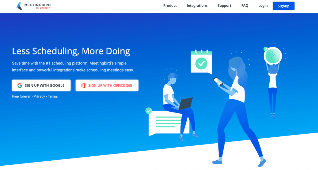
If you find someone with the same niche as you, it doesn't mean you need to change your niche. Your offer just needs to be better than theirs or articulated in a better way. You could even add a booster to differentiate yourself from competitors such as a “free bonus” with their purchase. Here is a great example from Meetingbird. Their booster is written under the CTA: “Free forever”
3. Write Your UVP
Clarity is Key
Most importantly your UVP needs to be short, sharp and super clear – leaving no questions about what you do. Don’t use jargon, use simple language. You don’t want them to tune out of your message even for just a second because they are trying to figure out what a word means.
Some tips for writing for clarity:
- Avoid long, complicated sentences
- Read through your statement and see if you can simplify it even more
- Ask for feedback. If a sentence has to be read twice to get the meaning, it needs to be changed. Join the Digital Mavericks Facebook Group and reach out to thousands of other business owners and ask for their feedback.
- Try to avoid sounding salesy and remember that a UVP is not a slogan such as Nike's “Just Do It”.
What To Include In Your UVP
There are many different ways to write your UVP. But the usual formula is a bold headline followed by 2 -3 sentences which further explains what you do, who you do it for and what the benefits are.
Some of the elements that you could include are:
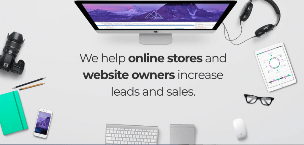
1. The Headline: a bold, short statement that explains what you do and what the benefit is. Take, for example, WP Elevation Coach Simon Kelly's website for his business Renegade Empire. It's short and super clear.
They build websites that “increase leads and sales” which is why you would choose them over someone who simply just builds websites. It also solves the problem that every website owner has – getting more sales.
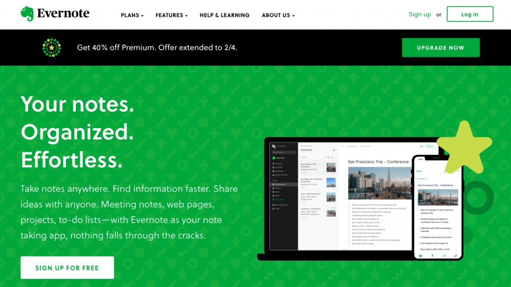
2. A 2–3 sentence paragraph under the headline: This is where you get a bit more specific on your offering. This paragraph from Evernote explains its benefits and functions clearly. It also solves the pain point of “things falling through the cracks”.
3. An image: Having an image is a good idea as it helps people remember your brand. But make sure you choose an image that is relevant and helps to explain what you do or what the benefit is. It may even be an image that sparks an emotional response in the viewer. Or perhaps it is a picture of a person or a thing that resonates with their desire or problem.
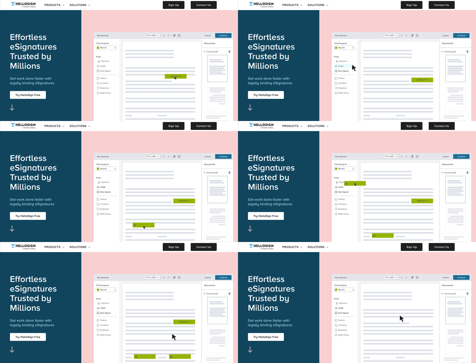
I like the use of a simple gif here in HelloSign's UVP as it shows exactly how it works and how easy it is to use.
But please note: be careful when using videos in your UVP as they can slow down the load time. Also, using sliders can affect your SEO, so it's best to choose one image or background only.
4. CTA: It is a good idea to include your CTA after your UVP so that the next steps are clear.
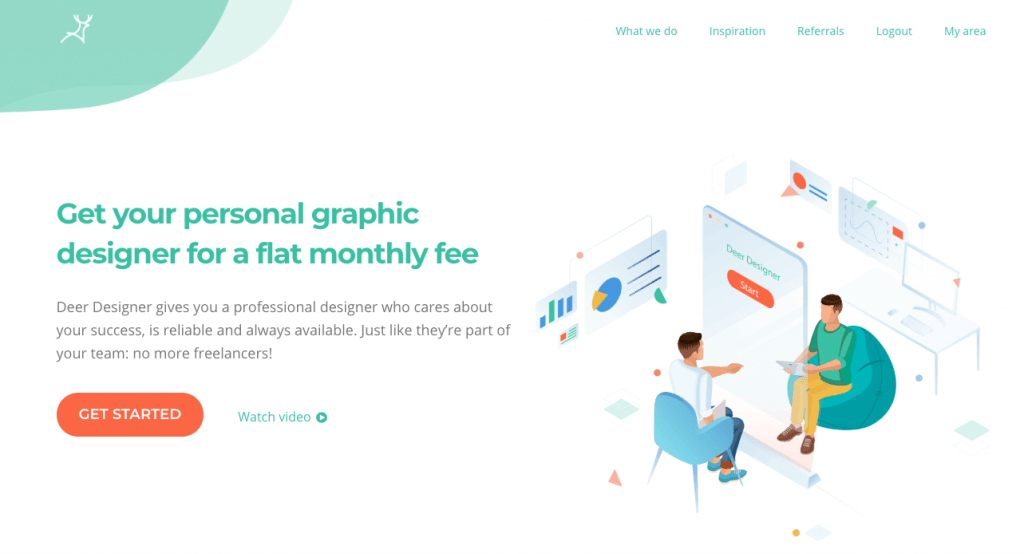
The CTA's below are clear. If the visitor knows they're ready to get started, they click “get started” to find out the next steps. Or the visitor may want to find out more from the video. The bold colour orange makes it stand out as well.
